Why FIWL exist?#

  1. Layouting System
    Imagine a word document, it is designed to arrange words and things like pictures from top to bottom. Overriding the layout is also possible by set the "element" position as absolute. This the same with HTML but with interaction ability. However, it is actually not optimized for building UI. Meanwhile, Android XML layout is a perfect fit for making UI Layout. In FIWL, we reuse that concept to building UI for web with a few adjustment.
  1. Straightforwardness
    We currently use HTML for almost anything including Web App front-end development. HTML itself mainly purposed for making interactive document. To make an app, we need some fancy tools like Bootstrap, SASS, web framework, jQuery, and a lot of dependencies. Nothing wrong with that, except complexity that will overwhelm in some cases. Beside of layouting system, FIWL also provides ready-to-use environment. Moreover, FIWL also facilitate interactivity (reactivity between widgets, you don't have to code for maintaining responsive & adaptive design).

How FIWL different from HTML?#

As example, let's make a login screen:
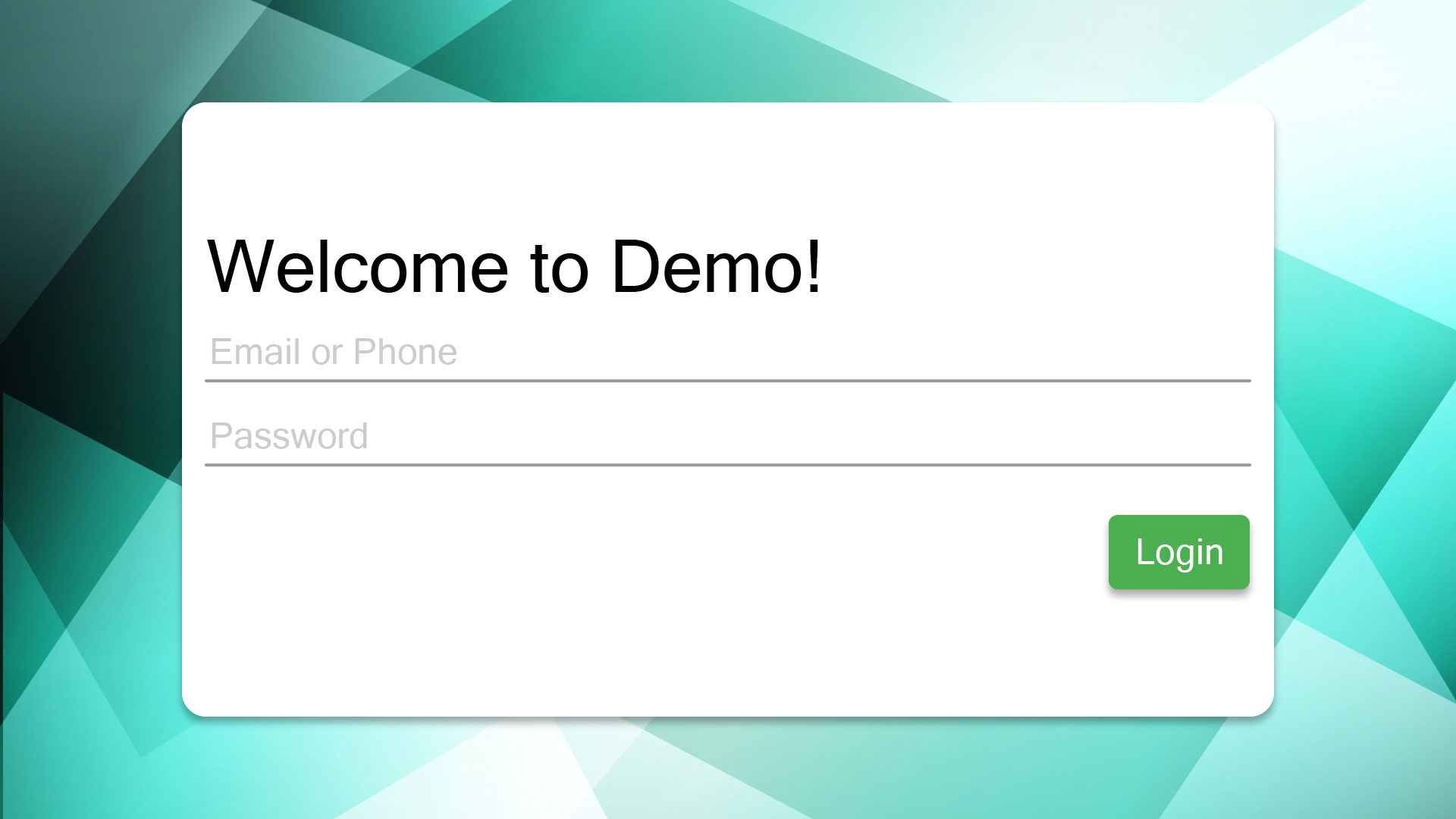
a simple login screen with a title, couple of input fields, and a button.

With HTML:#

<!DOCTYPE html>
<html>
<head>
<title>Login | Demo</title>
<meta charset="utf-8" />
<meta name="viewport" content="width=device-width, initial-scale=1.0" />
<style>
html,
body {
margin: 0;
padding: 0;
width: 100vw;
height: 100vh;
box-sizing: border-box;
}
#bg_image {
width: 100%;
height: 100%;
position: absolute;
top: 0;
left: 0;
}
#card {
width: 75%;
height: 75%;
background-color: white;
position: absolute;
top: 12.5%;
left: 12.5%;
border-radius: 16px;
box-shadow: 0px 5px 8px rgba(0, 0, 0, 0.32);
padding: 16px;
box-sizing: border-box;
}
#title {
width: 100%;
text-align: left;
margin-bottom: 16px;
}
.full-width {
width: 100%;
}
</style>
<!-- Styling for input text -->
<link rel="stylesheet" href="/style/textfield.css" />
<!-- Bootstrap CSS -->
<link
rel="stylesheet"
href="https://stackpath.bootstrapcdn.com/bootstrap/4.5.0/css/bootstrap.min.css"
integrity="sha384-9aIt2nRpC12Uk9gS9baDl411NQApFmC26EwAOH8WgZl5MYYxFfc+NcPb1dKGj7Sk"
crossorigin="anonymous"
/>
</head>
<body>
<img id="bg_image" class="fullsize" src="/img/login/bg.jpg" />
<div
id="card"
class="d-flex flex-column justify-content-center align-items-center"
>
<h1 id="title">Welcome to Demo!</h1>
<form
class="full-width d-flex flex-column"
method="POST"
action="/auth/login"
>
<div class="group full-width">
<input type="text" class="full-width" id="username" required />
<span class="highlight full-width"></span>
<span class="bar full-width"></span>
<label>Email or Phone</label>
</div>
<div class="group full-width">
<input type="password" class="full-width" id="password" required />
<span class="highlight full-width"></span>
<span class="bar full-width"></span>
<label>Password</label>
</div>
<button class="btn btn-success align-self-end">Login</button>
</form>
</div>
</body>
</html>

With FIWL:#

<stage title="Login | Demo">
<Layout alignContents="center">
<!-- No full resource URL required, explained on "Resource" page at Guide section. -->
<Picture
from="bg"
width="container"
height="container" />
<FormLayout
sendTo="/auth/login"
method="POST"
width="75%"
height="75%"
backgroundColor="@color/white"
cornerRadius="16dp"
elevation="8dp">
<Label
bold="true"
textSize="@style/titleTextSize"
text="Welcome to Demo!" />
<Textfield
name="username"
label="Email or Phone" />
<Textfield
name="password"
label="Password"
type="text|secret" />
<Button
id="submit"
alignSelf="right" />
</FormLayout>
</Layout>
</stage>
caution

FormLayout, Textfield, and Picture widgets are in development, so they won't work for now. See Development Checklist

...so what is FIWL?#

FIWL (Flexible Interactive Web Layout) extends XML standard, mainly purposed for arranging web app layout as efficient as possible.